When I receive an email with information about a meeting, I usually add it to my calendar instantly. This way, I don't forget about it.
I've watched a number of people want to add information to their calendar from an email and they complain about it being too cumbersome or taking too long. When I watch them, they will open up their calendar, navigate to the date they want, double click on the date, put in the time information, go back to the email, highlight and copy all of the information, go back to the calendar entry, and paste it in the notes. I usually will tell them that I understand why they don't like doing it that way.
Then, I show them how I do it. I always have the little calendar displayed in my To Do pane. If the meeting will be on a date displayed on that calendar, just drag and drop the email on to the date you want. This will automatically open up a new appointment entry, already have the date filled in, and already have pasted the text of the email into the notes section. All you have to do is add the time.
In the alternative, I will just drag and drop the email onto the calendar tab. Again, this opens up a new appointment window and pastes the email content into the notes section. All you have to do at this point is set the date and time.

A blawg devoted to providing practical tech tips to lawyers
Thursday, October 30, 2014
Tuesday, October 28, 2014
Recent Updates to Android Wear were Much Needed
Recently, the Android Wear operating system got an update that was somewhat overdue in coming.
One of the first things of note was the fact that there is no longer a card covering the main watch face. It was ok having a card covering half of the face at times; however, it really detracted from the idea of having a watch. Now, instead of having a card always peeking up, you just have to swipe up to bring the first card up.
Second, Google Play music is now available on the watch. With a pair of Bluetooth headphones, you can listen to music straight from your watch.
Third, when streaming music, there always was a card that showed you what was playing, and if you kept swiping, to the left you would find other controls. Now, a swipe to the left brings up four different buttons: one to skip forward, one to skip backwards, and two to adjust the volume.
All in all, this was an update that really increases the usability of Android Wear supported devices.
Monday, October 27, 2014
Inbox for Gmail: Definitely Worth a Look
I've been a fan of Gmail for a while. Recently, Google launched their new email client, Inbox, in an invite only system for now. This invitation system is nothing new for Google to do. Yeah, it is probably unnecessary and it probably is, at least in part, a marketing gimmick. Yes, I'm probably being a Google apologist for not feeling some outrage at this system, yet, I just don't. What I will say, though, is that the Inbox app is slick.
I've only had a couple days to play with it, and I've spent most of those days moving boxes as we moved into our new home. However, there are a lot of changes in Inbox that I like.
First, the design. I'm normally more of a function over form person. However, I think that the look of Inbox is just wonderful. It showcases the material design of Android 5.0 wonderfully. It is also just easy to navigate and use.
In the current Gmail app, the only preset bundles are Social, Updates, Forum, and Promotions. Inbox adds additional useful bundles like travel, purchases, etc. This helps keep your email sorted. Yes, power users probably already have rules and filters set up to do this automatically. However, I think the way Inbox does it is great.
Additionally, Inbox makes it easy to see all of your reminders. I'm constantly using Google Now to set reminders. Prior to Inbox, it was somewhat cumbersome to see your reminders. Inbox has an option for that right in the navigation drawer for easy access.
Additionally, the ability to snooze email or pin it to the top so that you don't lose it in the inbox is helpful.
All in all, my preliminary thoughts on Inbox are that it I'm going to stop using the Gmail app and site altogether in favor of Inbox.
So, if you haven't done so yet, request an invite or get an invitation from someone who already has Inbox.
Wednesday, October 22, 2014
Google Now Available on Most Android Devices
In the past, I'd mentioned that you could sideload Google Now launcher. At that time, it was for Nexus devices and not available through the Google Play Store. With it, you can swipe from the home screen and see all of your Google Now cards. Additionally, it allows you to say "Ok Google" from the home screen or when the device is plugged in and do a voice search.
Back in August, it became available for all devices running Android 4.1 or higher. So, if you didn't want to side load it, go install it from Google Play and give it a try.
Back in August, it became available for all devices running Android 4.1 or higher. So, if you didn't want to side load it, go install it from Google Play and give it a try.
Monday, October 20, 2014
Turn on Screen Touches when Casting Your Android Phone to a Group
One of the great things about Chromecast is the ability to show what is on your phone to a group. If you are giving a presentation on how to use the phone, it makes it possible for the group to see what you do in real time. Of course, by default, they won't be able to see exactly what and where you are touching the screen.
Fortunately, Android allows this to be shown in the developer options under settings. If you haven't enabled developer options, which is hidden by default, go to Settings and choose About Device. Tap on Build Number at least 7 times in quick succession. This will enable the developer options.
Within developer options, you can choose the "Show Touches" check box. Now, wherever you touch on the screen there will be a white dot. This will make giving group presentations about the benefits of using a smartphone much easier.
Friday, October 17, 2014
Use Rules and Assign Policies to Help Control Your List Email
List emails can be a tremendous waste of time if you let them. I'm on a number of different lists, and if I tried to read the emails as they came in every time, I'm not sure I'd be very productive. Rarely, if ever, has anything requiring my personal and immediate action come to me through a lists, and so, I see no reason for them to cloud up my main email inbox.
Instead, I have a folder for each list and use Outlook's rules to send all email from the list to the folder automatically. If there is an issue I'm particularly interested in following, I will modify the rule and add an exception so that the email doesn't go in that box. For example, I have a standing exception for any email where my name is specifically mentioned in the body of the email. This way, those emails show up in my main inbox, and since they're there instead of the usual place, I know there is probably some reason I need to pay more attention to it.
Another exception I have for my list email is if it is an invitation, which I do occasionally get. Those get through to the main inbox.
Once I have them all in their folder, I assign a policy to the entire folder. I have the folder only keep items for 30 days. After that, the emails are automatically deleted. Why? Otherwise, you end up with an unwieldy folder of stale emails. Additionally, if I haven't read the email within 30 days and am that far behind, the amount of unopened email in the folder will become too large for me to even want to try to read it.
This isn't about storage space or anything like that. It's about efficiency. If you have a lot of pointless email in your folders, it can slow down searches and make it harder to sort through search results. Plus, if you have 4000 unread emails, it can act as a mental barrier to not reading email.
I've found that this combination of rules and policies makes it much easier to sort my email in the main inbox and makes getting through to the important stuff easier.
Thursday, October 16, 2014
I Haven't Been This Excited About A Lollipop Since I Was Five
Ok, I admit it, I'm a total Google fanboy at times. Today is no exception. Earlier this year, Google previewed the newest version of its operating system, then called Android L. Out with Dalvik and in with ART. More battery options. Better security. Thousands of new APIs. And that doesn't even begin to address just how aesthetically pleasing it is to look at. Material Design is full of promise.
Lollipop will be rolling out soon, and I can't wait for it to come to my phone.
Lollipop will be rolling out soon, and I can't wait for it to come to my phone.
Wednesday, October 15, 2014
Free Alternatives to Adobe Products
If you don't follow Lifehacker, you're really missing out. One of their recent articles dealt with free and cheap alternatives to Adobe's creativity products. Where I work, I'm lucky enough to have access to Adobe Acrobat Pro, and I have a copy of Elements 10 for personal use. However, I haven't had access to Photoshop in years. I've never had the chance to play with InDesign and some of the others.
As attorneys, especially those with tight IT budgets, we can't always afford the cutting edge toys. It's important to give the open source stuff a try. In fact, you just might like it.
From that list, I've used GIMP as the Photoshop alternative for a long time now. There is no question that it takes a little getting used to, but for a free tool, it is fantastic. Moreover, there is plenty of help available on the internet.
The other tool on the list I use regularly is Inkscape. I love Inkscape. I used it in designing the graphics for my most recent Android game. I've used it for graphics on flyers and promotional materials. It is simply an awesome vector graphics engine. It also has lots of documentation and tutorials available on the web. I also found it to be more intuitive than GIMP was when I first started to use it.
I would definitely recommend reading the Lifehacker article and checking out some of these tools before shelling out the cash for Adobe.
Tuesday, October 14, 2014
Switching Google Accounts in Chrome Canary Just Got Even Easier
Two months ago I wrote about how Chrome Canary had made switching users easier by including a drop down menu in the upper right part of the screen. At the time, this was a huge improvement. Prior to this, changing users meant a longer process of signing out and signing back in. If you have a work and personal account and use one computer, this could be tedious.
In August, Chrome Canary introduced the drop-down box to assist in switching.

Clicking on this allowed you to choose "switch person" where you could choose which user to log in with. I always found there to be a large amount of lag in this opening, but it was still easier and quicker than the old method. This got added to the Beta version of Chrome in early September or late August I believe.
Today, however, when I fired up Chrome Canary, my little friend in the top right was gone. Instead, there was a picture of me in the top left.

When I clicked on it, it quickly brought up a drop-down with both my personal and work accounts. Clicking on my work account instantly opened a new session of Chrome with all of my work setup. This new method looks cleaner than the other, involves fewer steps, and works even quicker.
To put is simply, this newest change is wonderful, and again, I hope that Google makes it part of the stable version as it will greatly improve the usability of Chrome for those with work and personal accounts.
In August, Chrome Canary introduced the drop-down box to assist in switching.
Clicking on this allowed you to choose "switch person" where you could choose which user to log in with. I always found there to be a large amount of lag in this opening, but it was still easier and quicker than the old method. This got added to the Beta version of Chrome in early September or late August I believe.
Today, however, when I fired up Chrome Canary, my little friend in the top right was gone. Instead, there was a picture of me in the top left.
When I clicked on it, it quickly brought up a drop-down with both my personal and work accounts. Clicking on my work account instantly opened a new session of Chrome with all of my work setup. This new method looks cleaner than the other, involves fewer steps, and works even quicker.
To put is simply, this newest change is wonderful, and again, I hope that Google makes it part of the stable version as it will greatly improve the usability of Chrome for those with work and personal accounts.
Friday, October 10, 2014
I Try To Stay Out of the Google Now/SirI/Cortana Debates, But ...
I love Google Now. I sing its praises every chance I get. I haven't been exposed to Siri or Cortana, so I don't have first hand knowledge of how well they work. This is why I try to stay out of the Apple bashing that sometimes goes on.
However, this article from Stone Temple Consulting looks at how helpful these three apps are at providing instantly answers and useful answers. The clear winner: Google Now. And it wasn't even close.
I can't say that I'm surprised, and I'd be lying if I didn't admit to being at least a little smug and superior feeling to my iPhone colleagues.
Monday, October 6, 2014
If You've Even Thought About Coding for Android, get AIDE
In the past, I'd taken a couple of stabs at teaching myself how to code in Android. The setup, however, turned me away on the first couple of tries. Installing the Java developer kit and then the Android Development Tools and all of the SDKs seemed like a lot of work. And if it was that much work to install, it was going to be even more to learn. Eventually, I did it, and I enjoy programming for my phone.
Recently, I found an app for my Tablet and phone that let's you develop right on the device itself. AIDE is a free/paid Android IDE. It requires little to no setup to start coding. Simply switch to expert mode and you can code using either Eclipse or Gradle as your platform. Best of all, when you're ready to try it out, you simply run it from AIDE and it loads straight to your phone. No more emulators or connecting your phone to your computer.
You can store files locally or on DropBox or using Git. However, Git pushes do require the upgrade. You can also clone GitHub projects in the App and run them. This is something I find to be unbelievably useful.
With the free version, you're limited to only being able to save apps with a limited number of classes and files. This was the reason I actually went with the upgrade.
If you buy a subscription, you can actually watch tutorial lessons. I can't comment on the quality of the lessons as I have not watched them and probably won't.
So who is this for? I'd recommend it for those interested in giving Android Development a try but are intimidated by the desktop setup. You won't get as much help from AIDE in terms of auto-completion as you would Eclipse or Android Studio, but the fewer hassles are worth it. Additionally, if you're interested in easily cloning and installing GitHub projects, it seems like a no-brainer to me.
Friday, October 3, 2014
When Should I Create a Macro for a Given Word Task?
A colleague asked me recently when she should create a macro in MS Word for a particular task versus just plowing ahead and doing it the long way. My off the cuff response was, "create a macro if it is going to save you time in the long run", which is less than helpful. How could she know if it would save her time in advance? How much time would it have to save to be worth it.
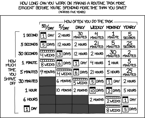
So, here is the long answer. Check the following XKCD chart, which I keep bookmarked:

http://xkcd.com/1205/
What does this mean? Well, if the task in question is something you do once a day and a macro would save you 5 seconds and you expect that you'll be doing the task daily for the next five years, then you should create the macro if you can do it in less than 2 hours. In other words, even if it takes you an hour to create a macro that only saves 5 second of your time, if it is a task you do daily, then it would be a good time investment. If you only want to amortize the time out over a year, divide by 5, which means you could devote 24 minutes to it and come out ahead.
How long does it take to create a macro. It depends. If you're going to use a macro that just types out a long paragraph or two, then not long at all. The next time you go to type it, simply record it as a macro and you're done. Quickly assign it a shortcut key and you're saving your 5 seconds. And, this should only take an extra minute longer than doing the task by hand, which means you're going to be well within the 2 hour or 24 minute time limit.
If you're going to have to get into the details of VBA and coding a macro, it could be a lot longer, especially if you're not familiar with VBA. I've had a number of times where I go to make something simpler by coding a macro from scratch and I end up burning way more time than it saves because I had to do so much research on how to write the code.
The long and short of it is: if creating the macro is simply a matter of recording what you do, then you should almost always err on the side of recording it. In the long run, you'll probably save time. If it is going to require anything more than that, I'd talk to someone before trying to do it on your own.
So, here is the long answer. Check the following XKCD chart, which I keep bookmarked:
http://xkcd.com/1205/
What does this mean? Well, if the task in question is something you do once a day and a macro would save you 5 seconds and you expect that you'll be doing the task daily for the next five years, then you should create the macro if you can do it in less than 2 hours. In other words, even if it takes you an hour to create a macro that only saves 5 second of your time, if it is a task you do daily, then it would be a good time investment. If you only want to amortize the time out over a year, divide by 5, which means you could devote 24 minutes to it and come out ahead.
How long does it take to create a macro. It depends. If you're going to use a macro that just types out a long paragraph or two, then not long at all. The next time you go to type it, simply record it as a macro and you're done. Quickly assign it a shortcut key and you're saving your 5 seconds. And, this should only take an extra minute longer than doing the task by hand, which means you're going to be well within the 2 hour or 24 minute time limit.
If you're going to have to get into the details of VBA and coding a macro, it could be a lot longer, especially if you're not familiar with VBA. I've had a number of times where I go to make something simpler by coding a macro from scratch and I end up burning way more time than it saves because I had to do so much research on how to write the code.
The long and short of it is: if creating the macro is simply a matter of recording what you do, then you should almost always err on the side of recording it. In the long run, you'll probably save time. If it is going to require anything more than that, I'd talk to someone before trying to do it on your own.
Thursday, October 2, 2014
Tasker for Attorneys: Turn off Your WiFi When It Isn't Needed
Like many attorneys, I am on the road a lot. It doesn't make sense to have my smart phone constantly searching for a WiFi signal when there is none nearby, or, at least, there are none nearby I want to connect to. FutureLawyer highlighted this problem in a post today.
Yet, I also don't want to have to remember to constantly turn it back on when I'm at home or the office. This is another time when Tasker can be a big help.
Previously, I had shown how you can silence your phone when you get to the court house. Today's post will start out the same way.
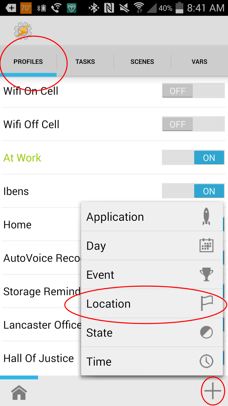
To do this, open Tasker, go to the profile tab, click the + in the lower right, and choose Location.
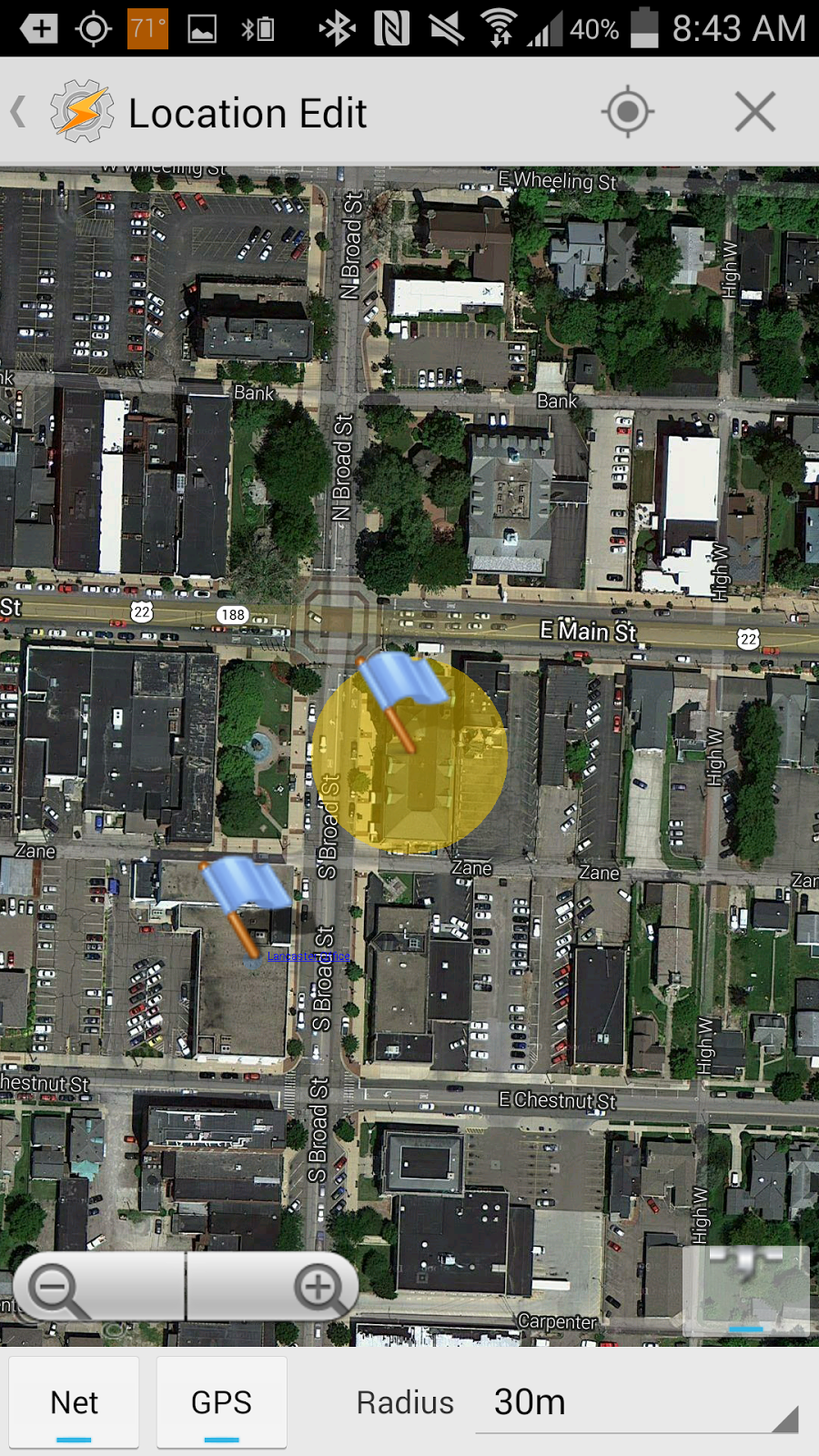
When you do this, you will then scroll to the top and choose "+ New Location". This will then bring up a map. There, find the location of the area where you want your wifi to be on. Then, long click in the middle of the location. I typically set the radius to either 30m or 50m. Once you've done this, you should have a flag over your location with a yellow circle. This yellow circle shows an area that, if you set foot in it, your phone will trigger.
Once you have it set up how you like it, tap on "Location Edit" in the top left. It will ask you to name your location. I typically just give it the name of the WiFi network or place I'm at. It will then ask you what task to assign the profile. Choose new task and name the task, if you like.
For the entry task, choose the "Net" Action Category and then choose the "WiFi" net action. You will then set it to "On". Then, at the profile page, long click on the task associated with your WiFi profile and choose "Add Exit Task". Again, the task will be in the "Net" category and the "Wifi" action, only set it to off.
Now, when you enter the area designated in your profile, your WiFi will automatically turn itself on, and when you leave the area, it will automatically turn itself off.
Wednesday, October 1, 2014
Is Your Practice Designed to be User Friendly?
This morning, I read an article on Wired about the how the roll out of HealthCare.Gov brought to light the importance of design. As the article says, the design in question is not just whether the colors are appealing, but whether the overall design one that the user can get exactly what he or she wants without having to call a help line or read an lengthy manual.
This led me to think about my own legal services program and law practices in general. When a client comes in, does the design of our practice seem intuitive to them? Is it inspiring confidence? Do they leave feeling more confused than when they entered? Is the way we do business designed to make it easy for the client to get their question answered? Do our clients get lost in the amount of paperwork they have to sign in order to get a question answered about paperwork someone else had them sign?
It is tempting to say that, "well, the practice of law is different than a website. What we do is much more complicated. Design isn't important."
I couldn't disagree more. As lawyers, our job is to help our clients understand their legal rights and, if necessary, vindicate those rights when they have been violated. If our clients come to us and can't understand what we are talking about or if it takes a lot of unnecessary work on their part to get their questions answered, then we are not effectively doing our jobs.
Where are some areas we can improve our design? Informative websites that aren't cluttered with disclaimers to the point that the useful information is lost. Avoiding jargon in talking with our clients. Keeping the paperwork to the minimum (what client who comes in with a contract problem wants to read through a 15 page dense representation agreement to get a simple question answered?)
So, is your practice well designed for your clients, or is it well designed for you? It is not an either or question, but I suspect that all too often, the answer will be heavily slanted towards us and not the clients. And in doing so, we frustrate our clients.
Subscribe to:
Comments (Atom)